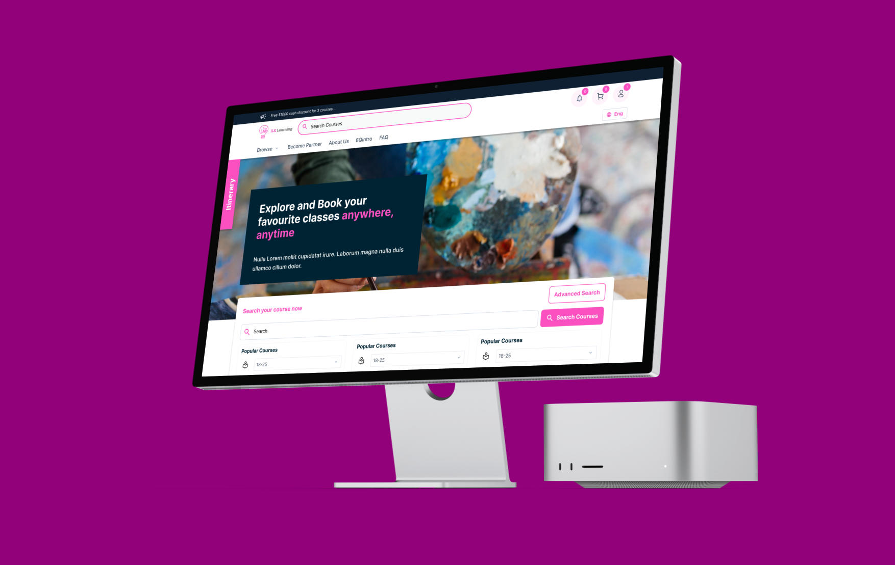
A comprehensive UX/UI redesign of an enterprise HR and business management platform addressed key usability issues leading to customer dissatisfaction. Through research, iterative design, and a new design system, the project attracted 10+ new enterprise clients within three months and boosted user satisfaction by 43%.
The platform, despite its comprehensive features like HR management and attendance tracking, was losing market share due to usability and aesthetic issues, not missing functionality. Sales had been declining for two years, with customer feedback highlighting these concerns.
Why It Mattered
The company aimed to enhance the product's appeal to attract new customers and simplify user flow, necessitating a complete redesign rather than just adding features.
My Role:
UX & UI Designer (from research to delivery)
Timeline:
4 months (research and discovery: 3 weeks; design and iteration: 6 weeks; handoff and launch: 3 weeks)
Tools:
Figma (design and prototyping), Miro (collaborative ideation and journey mapping)
Deliverables:
Redesigned core user flows, comprehensive design system, 12+ high-fidelity screens, interactive prototypes for usability testing
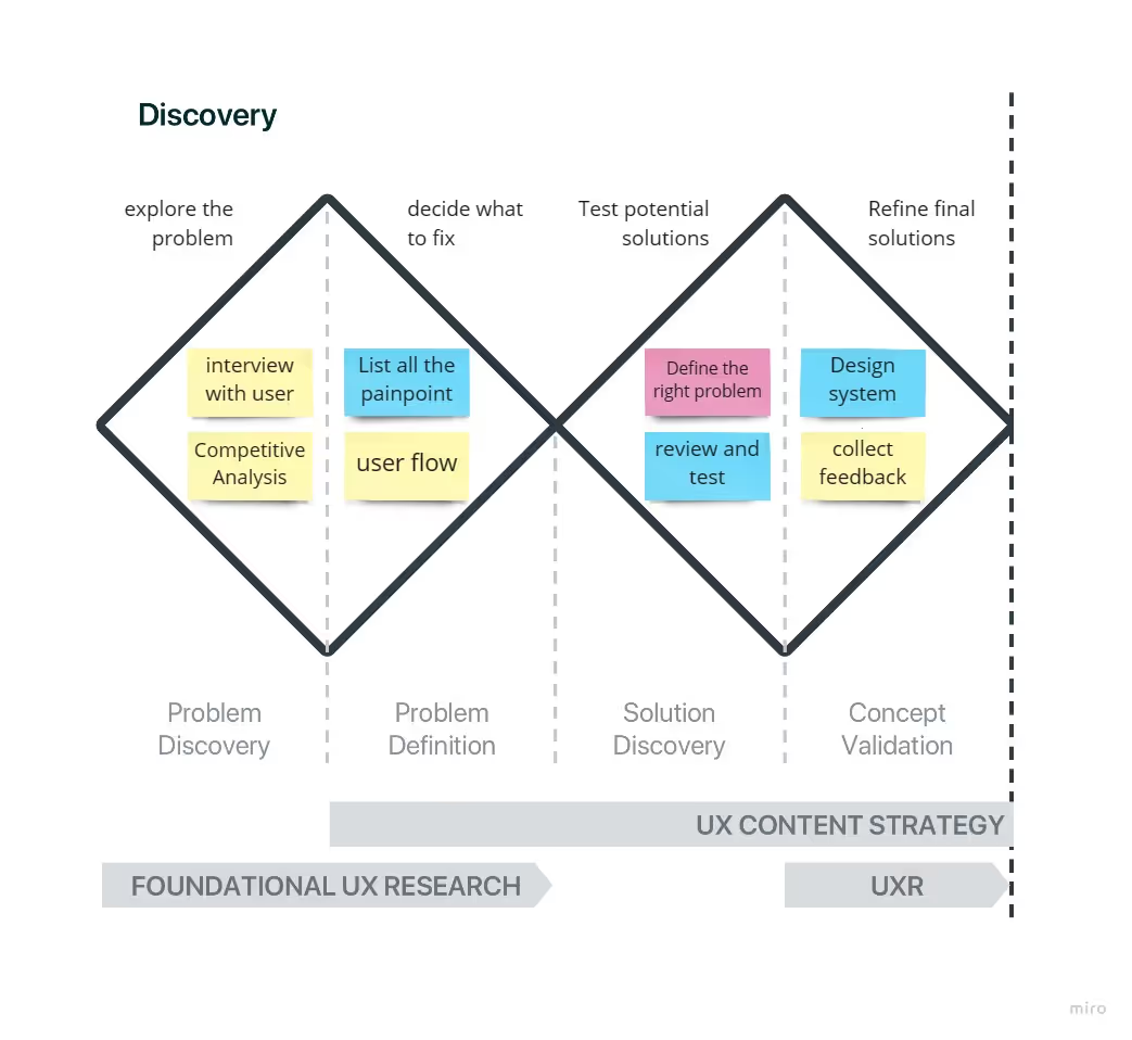
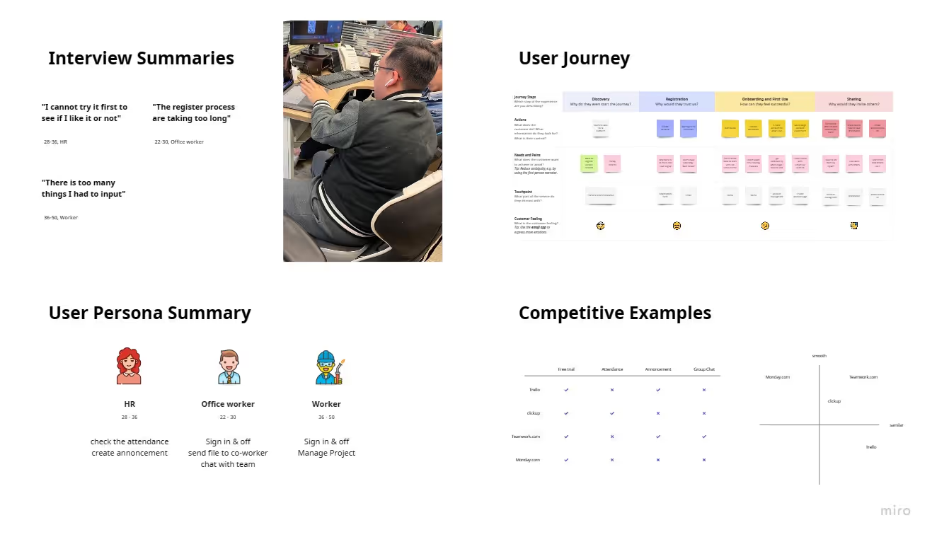
User Interviews (10 Churned Users) + A/B Testing
User Interviews target:
The people who no longer using the platform
"I logged in and saw a compticatied page. I spent 30 minutes looking for the button and then gave up."
→Animated Onboarding: Added a "Welcome Tour" video to guide users immediately.
A/B Testing (Old vs. New)
We asked 6 users to "Find the Attendance Report."
Users on the Old UI took an average of 3.2 clicks and failed 4/6 times.
Users on the New Sidebar Navigation took 1.1 clicks and succeeded 6/6 times.
user interviews + 47 support tickets + competitive analysis, revealed 5 critical problems:
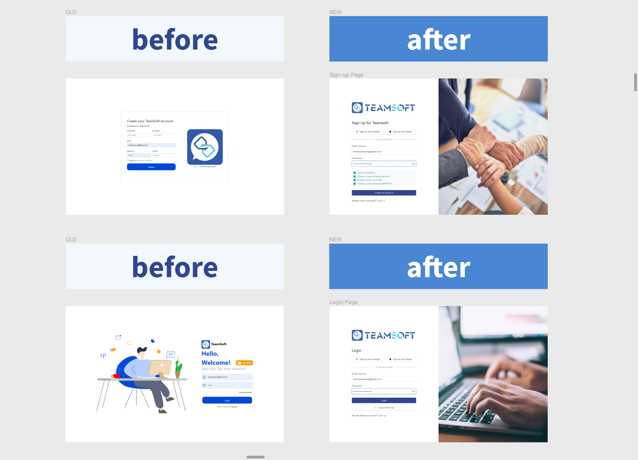
1. Signup Friction
73% of new users needed support to complete signup; 12+ field form
→ High churn before users even enter product
2. Onboarding Confusion
Users spent 45 min finding core features; no guidance provided
→ Users couldn't derive immediate value
3. Visual & IA Issues
58% missed critical buttons; inconsistent spacing; dated aesthetic
→ Poor product perception &credibility
4. Navigation Problems
3.2 clicks avg. to find core features; unclear labels
→ Low feature adoption; high support burden
5. Business Model
Perpetual licensing vs. competitors' trials; 40% of prospects dropped off
→ Lower conversion vs. benchmarks
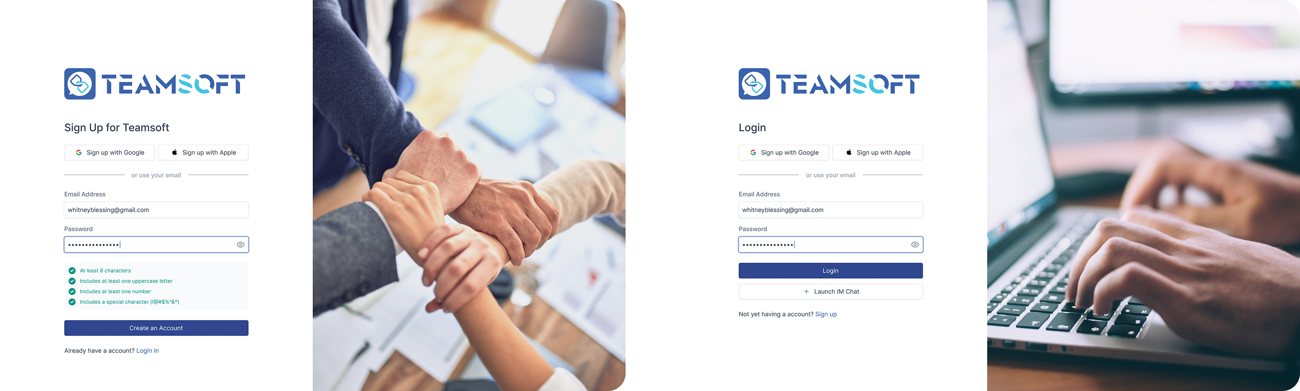
12-field form → 4-step journey (2-3 fields/step).
Testing showed: 4-step flow 100% completion vs. 40% for single-page form
Result: 66% faster signup (12 min → 4 min)
3-screen animation + 2-min demo. Testing: 7/8 watched full video.
Result: 78% onboarding completion (+44%), 88% faster feature discovery
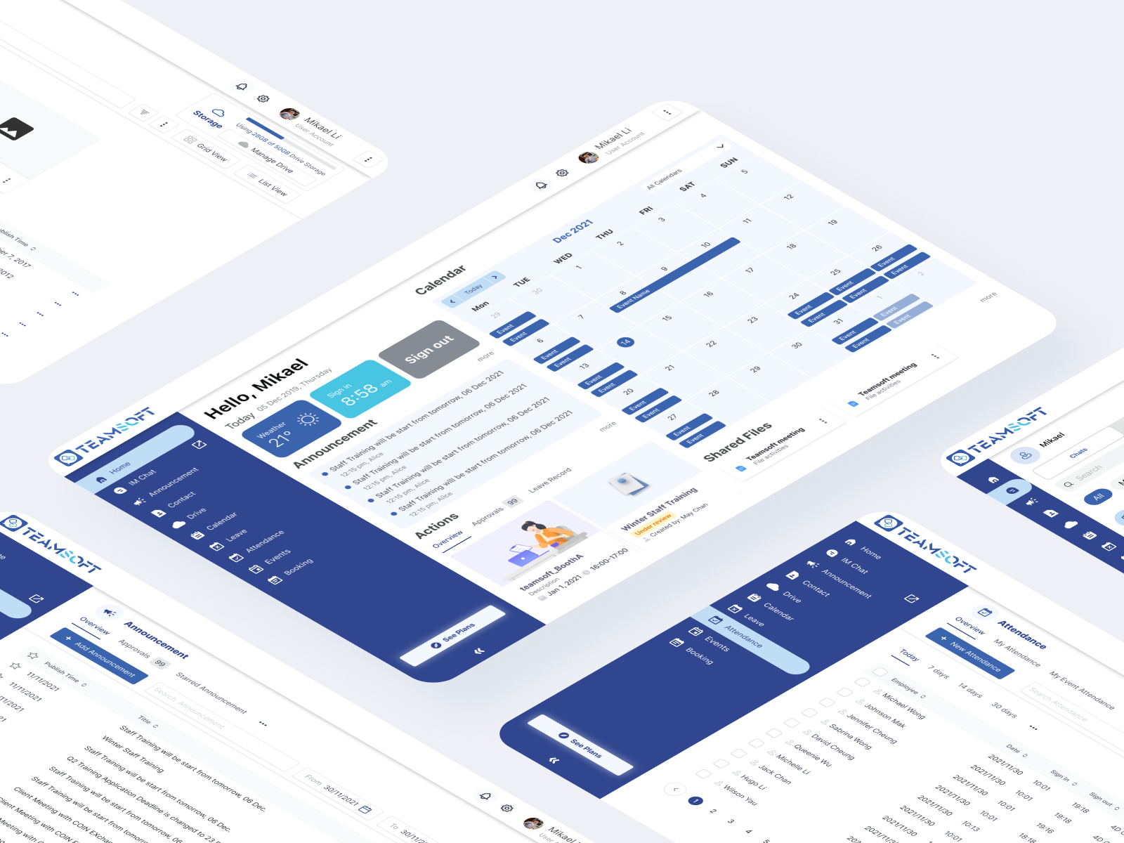
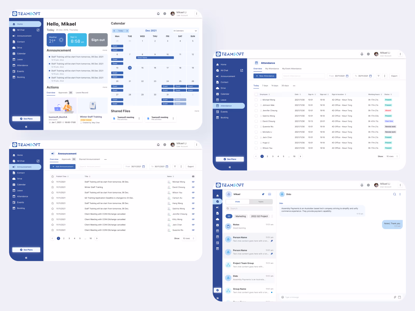
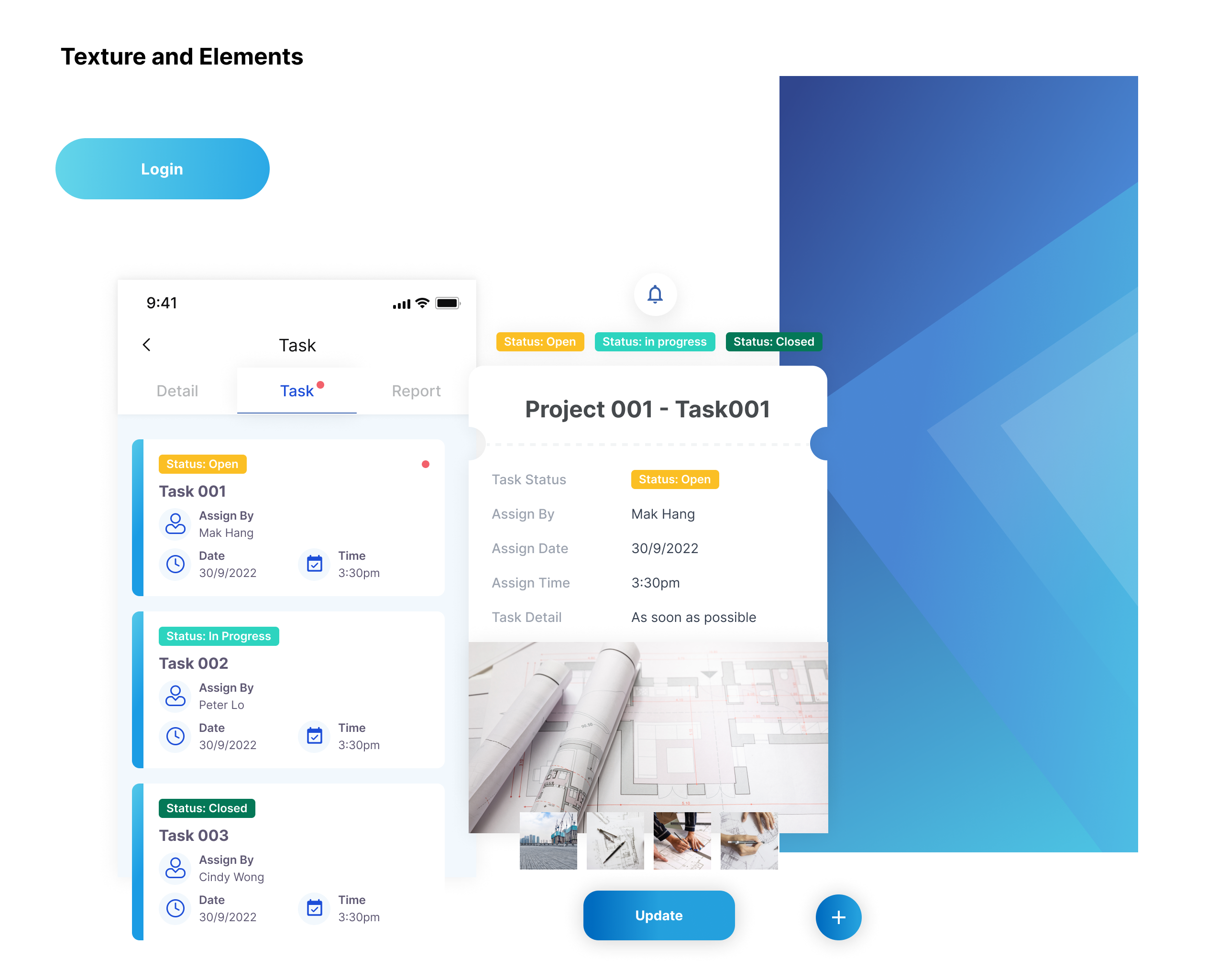
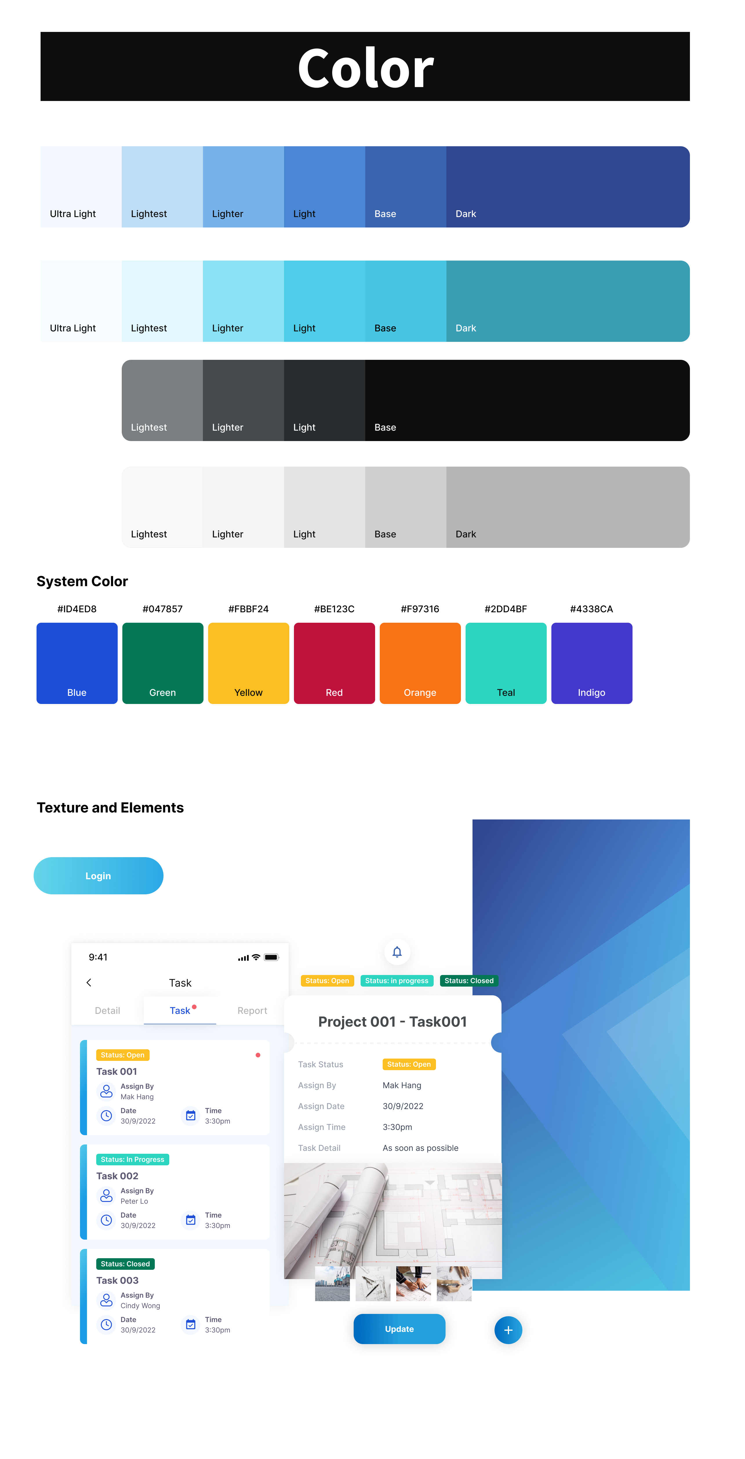
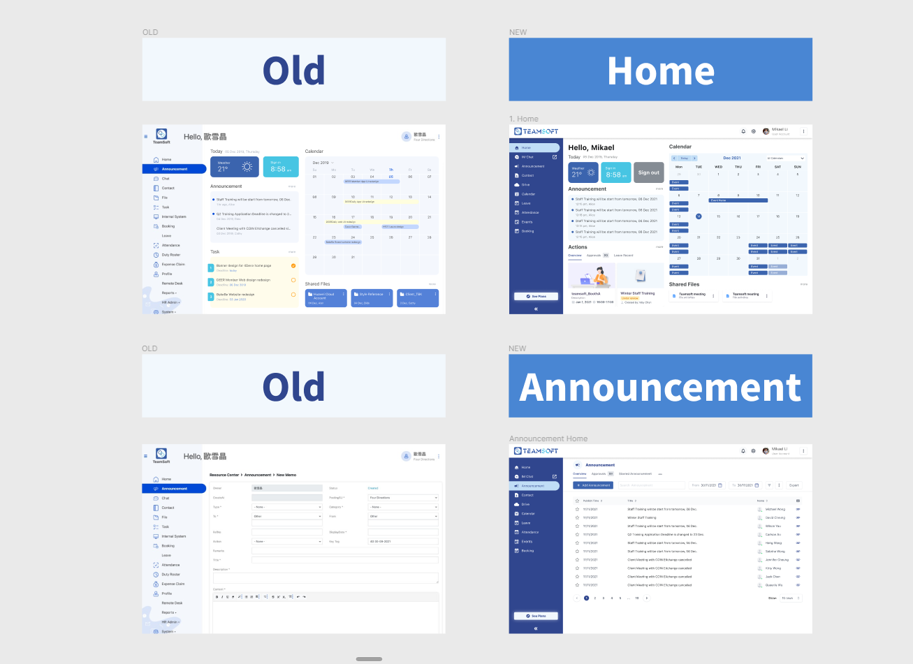
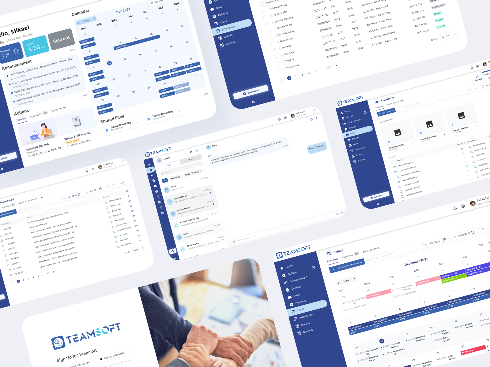
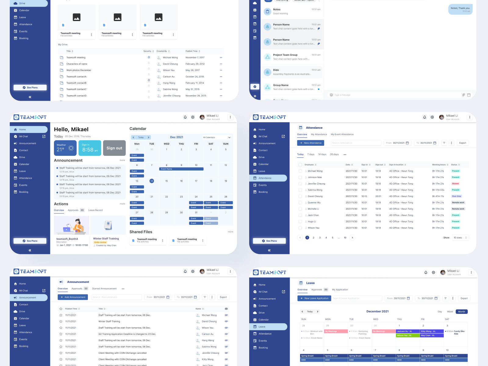
Built design system with 47 reusable components, dark theme (80% of competitors use), standardized spacing (8px grid).
Result: 40% faster design-to-dev handoff, improved accessibility (+23% readability)
14-day trial (no CC). Removed 40% prospect barrier.
Result: 156%+ in trial signups, 38% trial-to-paid conversion (+26% vs. previous model)
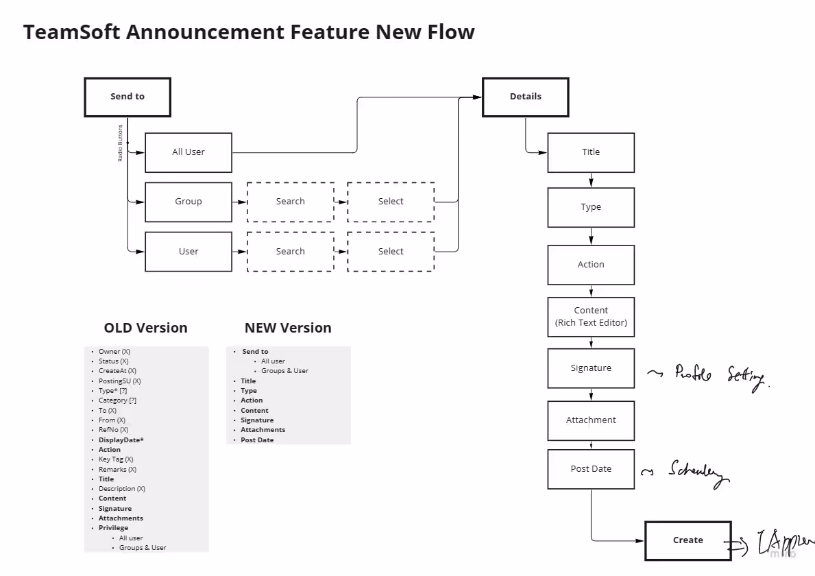
Redesigned navigation with action-oriented labels, persistent sidebar, breadcrumbs.
User testing: 3.2 → 1.1 clicks to core features.
Result: 65% fewer clicks, 42% higher feature adoption
Create Design
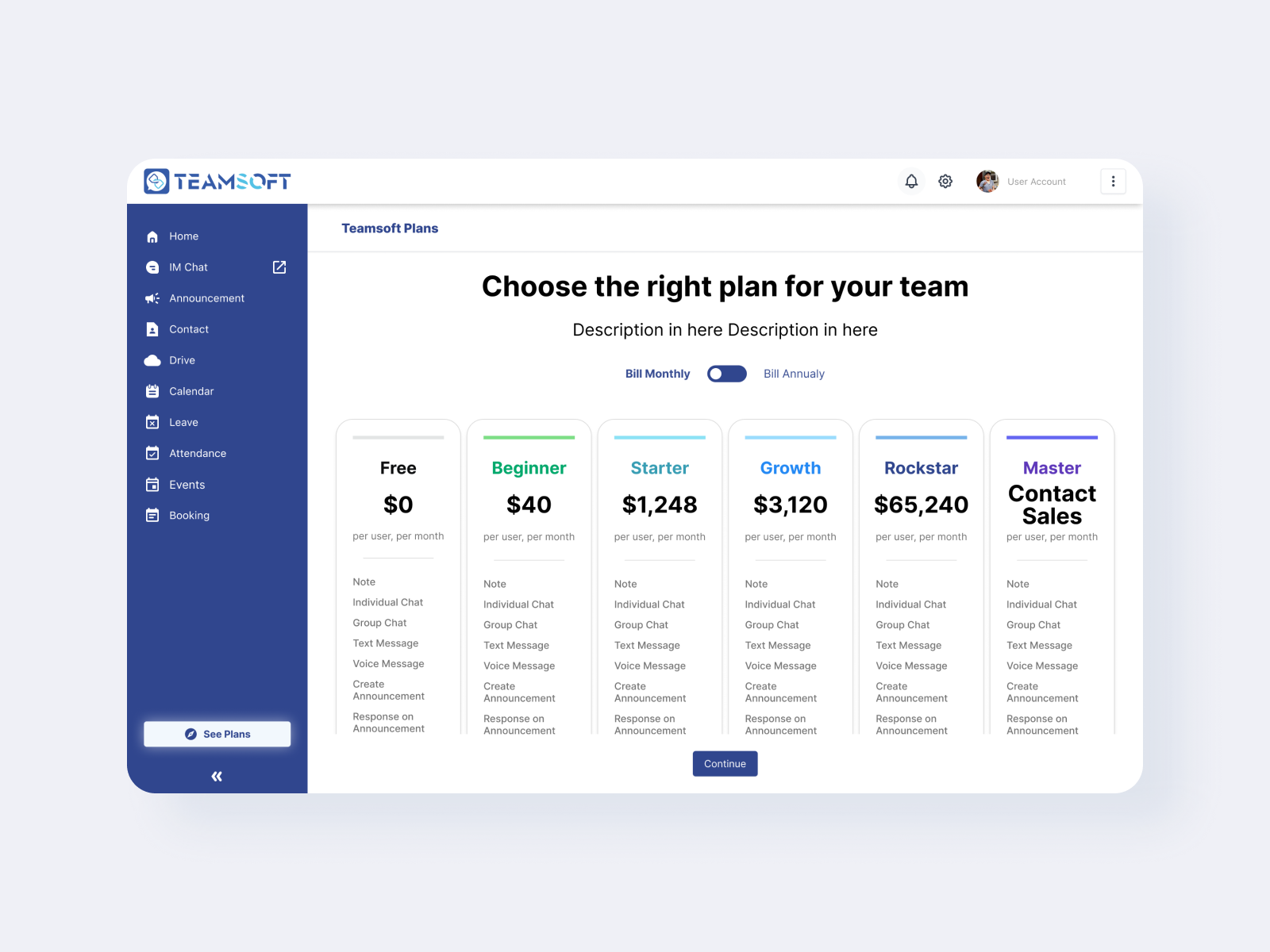
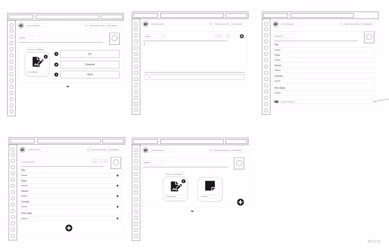
HiFi: Designed 12+ screens (login, dashboard, attendance, etc.).
Created interactive prototypes in Figma with transitions and animations.
Design System: 47 components fully documented for dev handoff
User Testing (3 Rounds)
Signup: 5 users tested; 100% completion vs. 0% on previous version
Navigation: 6 users tested; 6/6 completed tasks on first attempt vs. 2/6 previously
Mobile: 4 field users tested; all completed without assistance
New client acquisition: 10+ enterprise clients (construction and manufacturing companies)
This represented a 2x increase vs. previous quarterly average
Trial-to-paid conversion rate: 38% (3x increase vs. 12% under previous model)
Onboarding: 98% completion (+44%)
Customer satisfaction score (CSAT): 4.6/5 (+43% vs. 3.2/5 pre-redesign)
• Mobile attendance check-in
• Real-time project tracking
• Auto-reports
• All three features drove adoption in construction/manufacturing verticals
What Worked:
Multi-method research justified every decision. Early testing caught issues. Design system accelerated future work.
What I'd Do Differently:
• Share research earlier with stakeholders
• Plan 1-2 weeks post-launch iteration
Skills Gained:
Research methodology, design systems, stakeholder communication, business impact thinking