Designed a high-conversion website for a premium wedding banquet brand, balancing emotional storytelling with functional clarity. By optimizing the "Inspiration-to-Inquiry" user journey and implementing an immersive gallery system, the redesign increased venue inquiries and established a digital presence that matches the brand's luxury reputation.
Context: Victoria Harbour Supreme offers grand, romantic wedding venues but lacked a digital presence that matched its physical elegance.
The Problem: The previous experience failed to convey the "sophistication and nobility" of the venues. Users struggled to find practical info (menus, capacity) amidst the visuals.
The Goal: Create a "Romantic Utility"—a site that feels like a fashion magazine but converts like a booking engine.
Deliverables: Responsive Website, UI Style Guide, Interactive Venue Gallery
Competitor benchmarking + Client workshops revealed distinct needs for the two key user types:
The Visual Dreamer
"I need to feel the atmosphere."
Immersive Galleries, Full-screen imagery, Emotional storytelling.
The Pragmatic Planner
"Can we afford this? Does it fit 20 tables?"
Clear Specs, Downloadable Menus, Easy "Book Tour" CTAs.
.png)
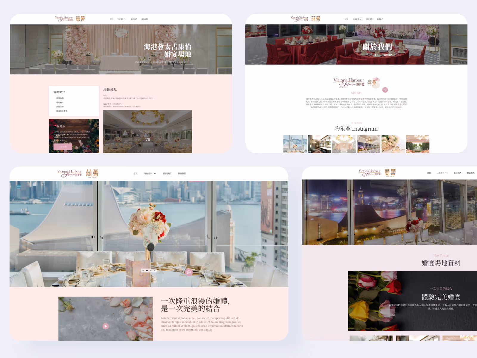
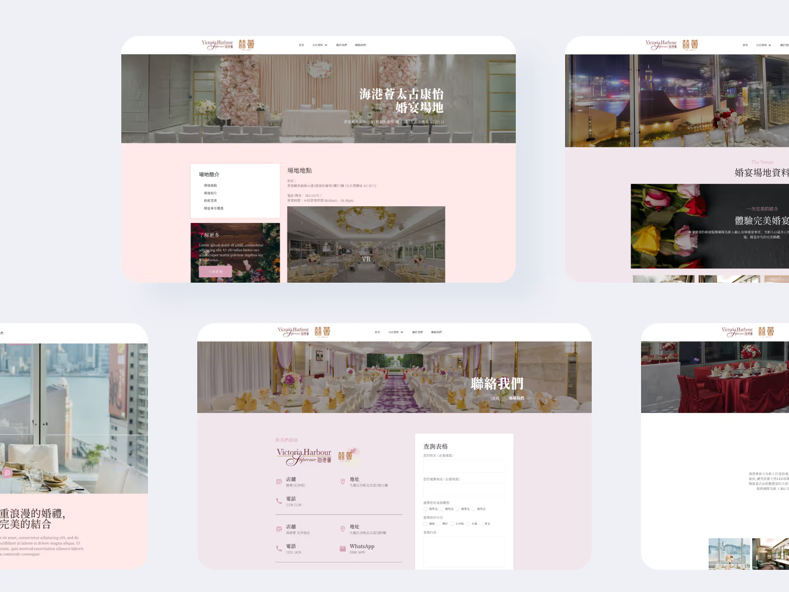
1. Immersive "Hero" Storytelling
Designed a cinematic homepage carousel with high-resolution imagery to capture immediate emotional engagement.
Result: "Show, Don't Tell" approach drove immediate user engagement.

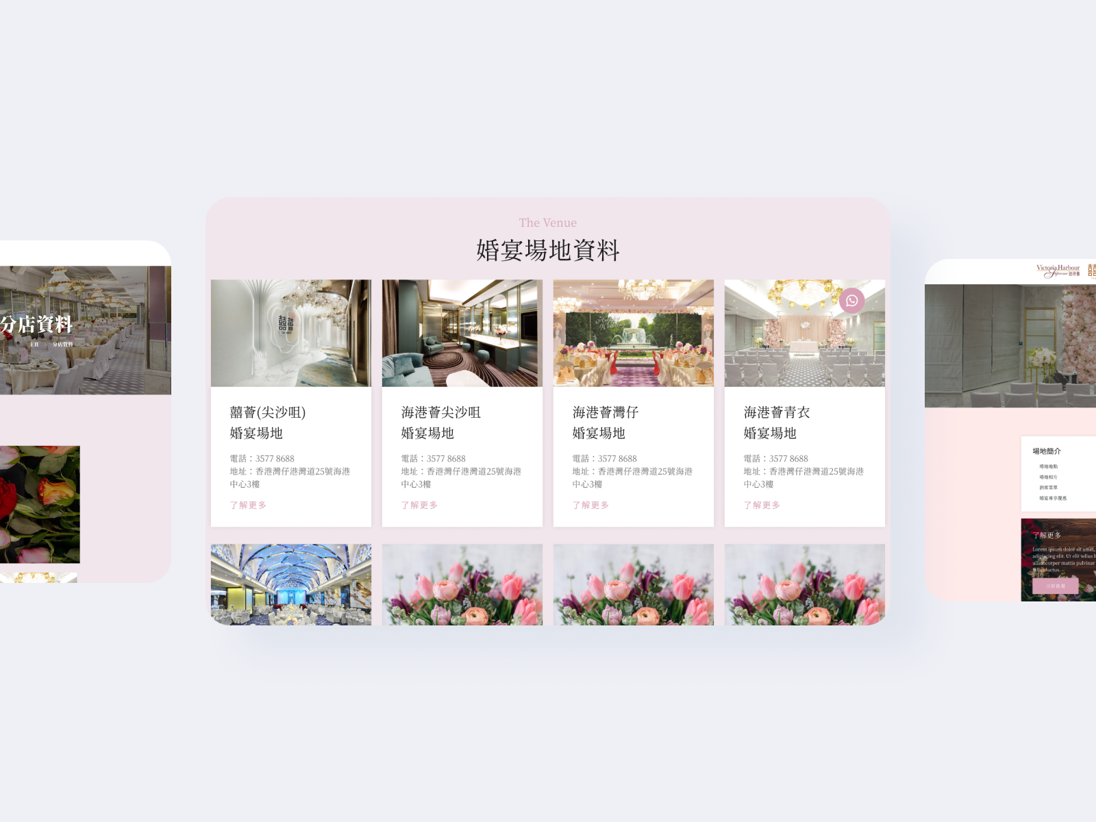
2. The "Interactive Venue Gallery"
Built a dynamic gallery module allowing users to filter by "Décor Style" and "Location."
Result: Solved the "Comparison" pain point, helping couples quickly identify venues that match their theme.
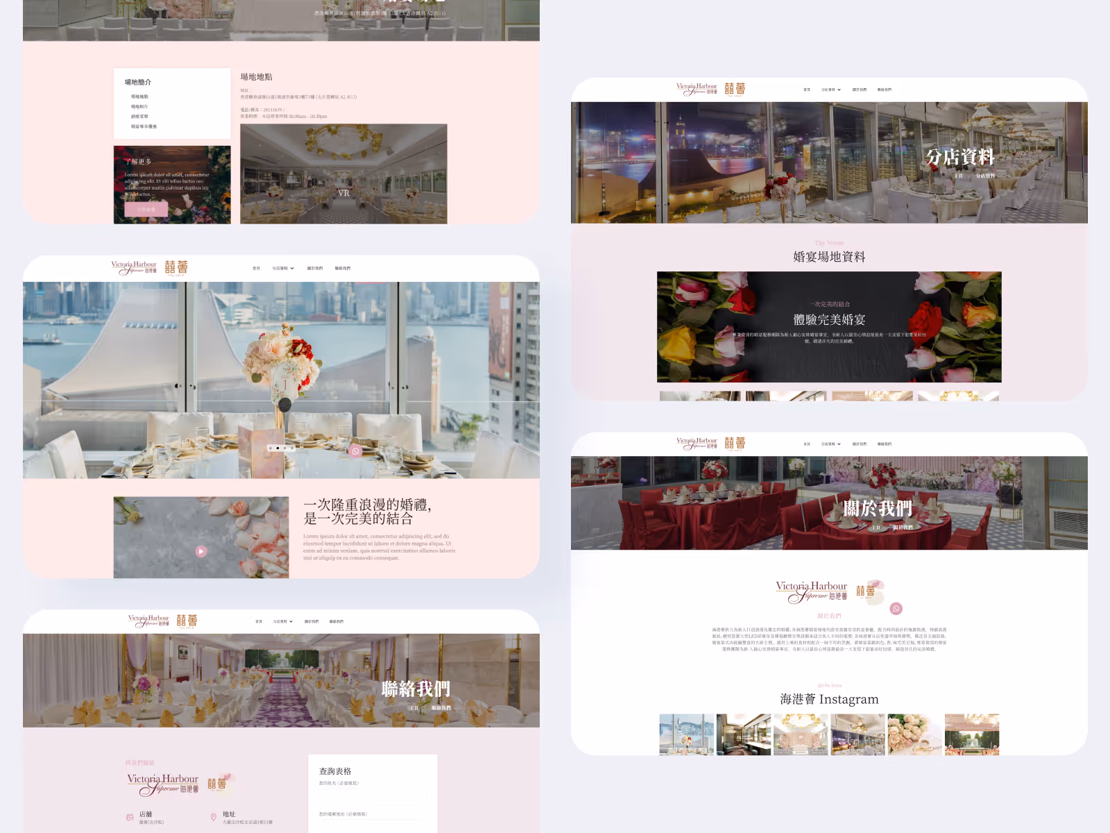
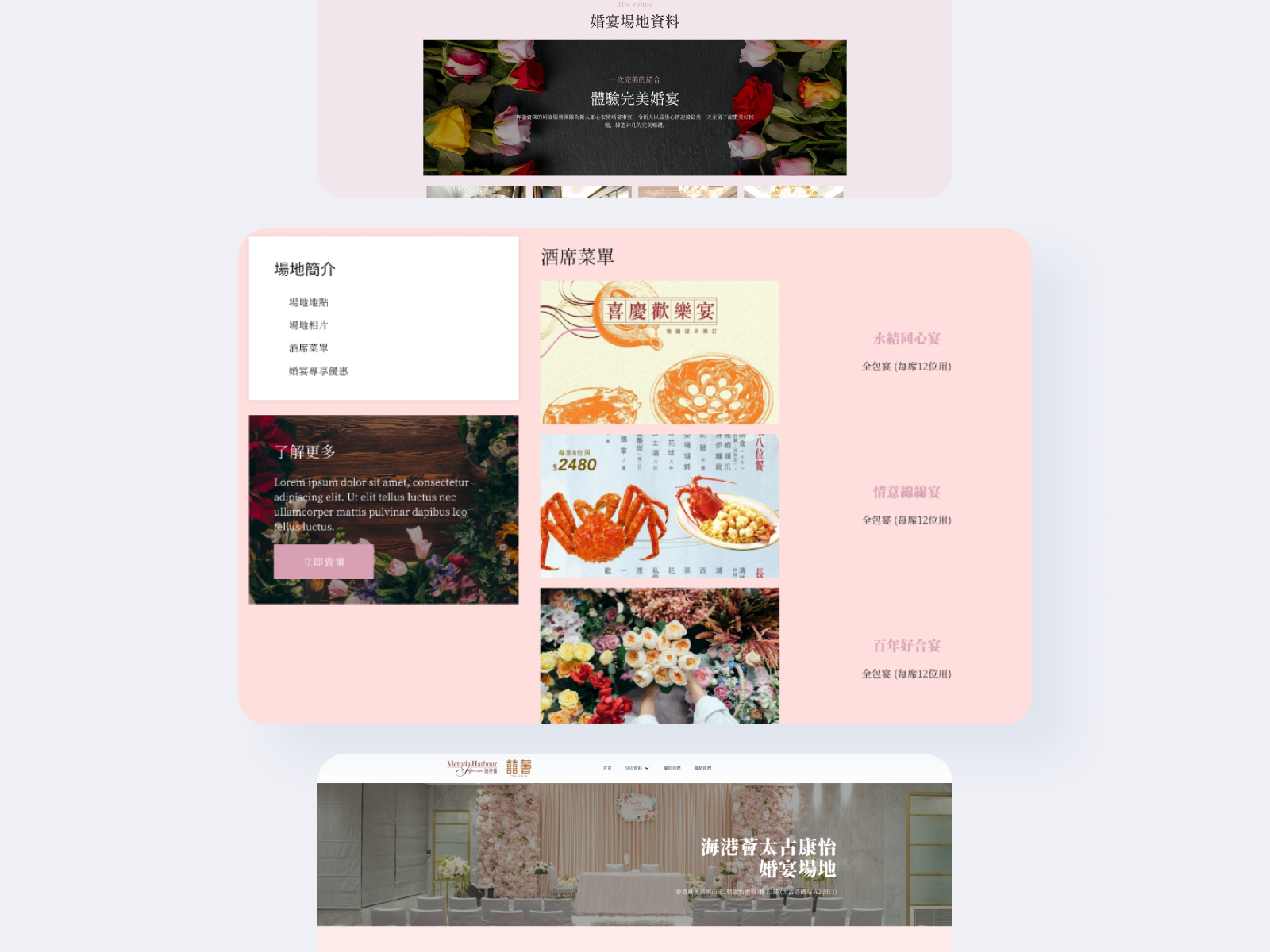
3. "Menu Preview" Module
Created an appetizing, organized layout for banquet menus, structured into scannable cards.
Result: Improved readability for the "Pragmatic Planner" needing clarity on food options.
4. Optimized Inquiry Funnel
Placed "Book a Tour" CTAs strategically at high-intent moments (e.g., after viewing a gallery).
Result: Reduced the friction between "falling in love with a venue" and "contacting sales."
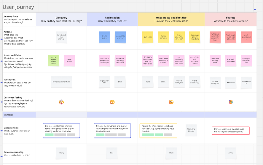
Journey Mapping:
Mapped the flow from Inspiration (Gallery) → Exploration (Menu/Specs) → Decision (Inquiry), identifying drop-off points in the old flow.
Usability Testing:
Client feedback sessions revealed a need for a "Comparative View" of venues, leading to the "Venue Comparison" feature.
Visual Design:
Developed a "Premium" style guide with elegant typography (Serif headings) and spacious layouts to mirror the venue's "nobility."