%201.png)
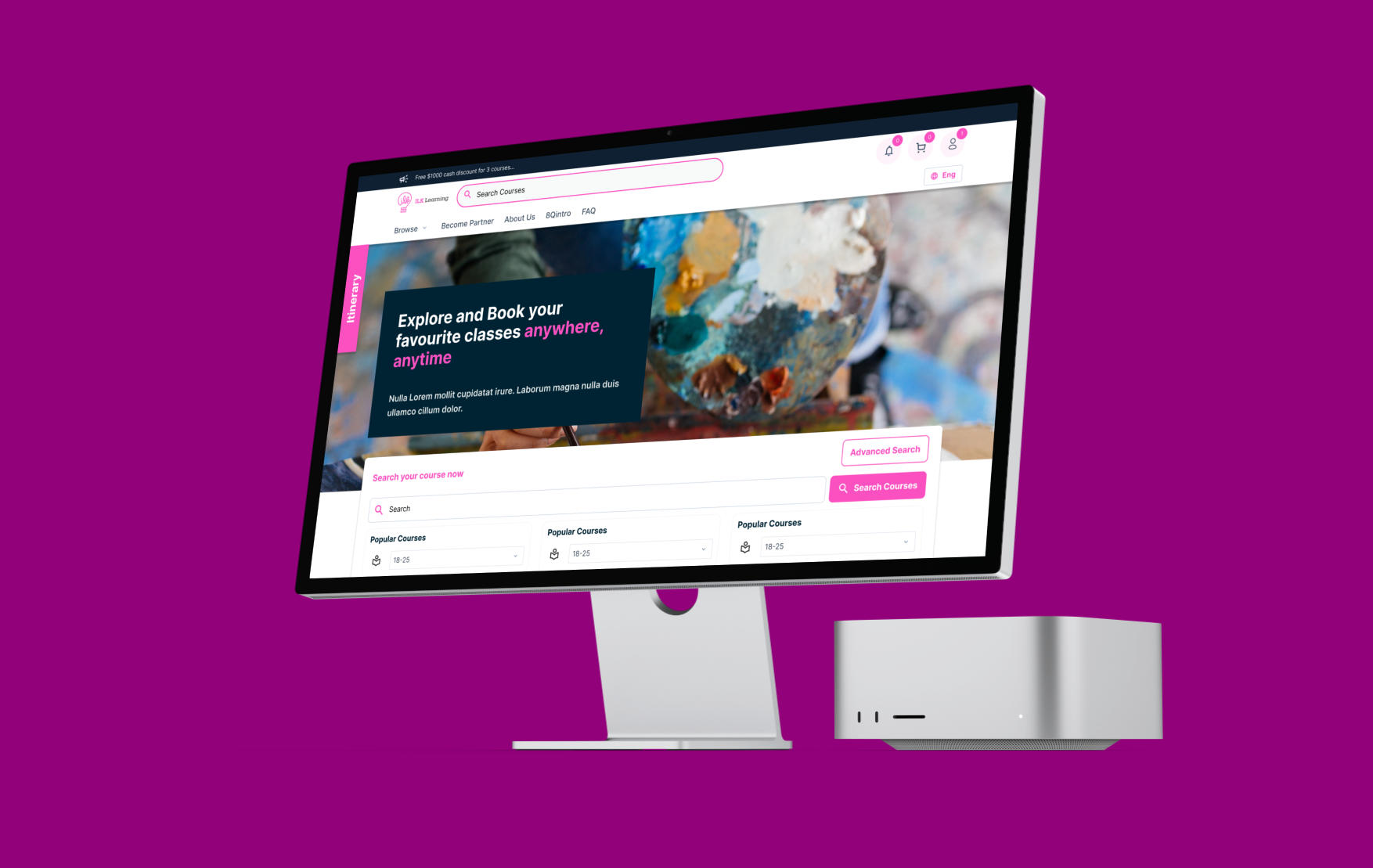
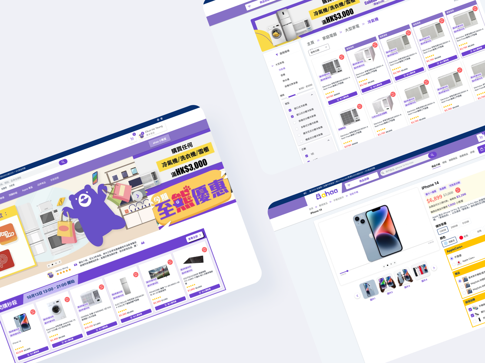
A comprehensive UX/UI redesign of ahaa (a Dah Chong Hong / DCH Living sub-brand), transforming a fragmented online store into a fully responsive eCommerce platform. By streamlining the checkout flow and enhancing product discoverability, the redesign decreased cart abandonment by 35% and increased online sales by 25% in the first quarter.
Context: Ahaa aimed to capture the competitive Hong Kong electronics market (vs. HKTVmall, Fortress, YOHO).
The Problem: The existing site suffered from cluttered navigation, weak search functionality, and a high-friction checkout process, leading to user drop-off.
The Pivot: After development, the strategic direction shifted to merge with the main DCH Living platform. The flexible design system successfully adapted to this major rebranding without improved development delays.
- My Role: UX & UI Designer (Research to Hi-Fi Delivery)
- Tools: Figma (Prototyping & Design System) & Miro (Information Architecture & Card Sorting)
- Deliverables: Information Architecture, Sitemap, Responsive Website Design, Design System
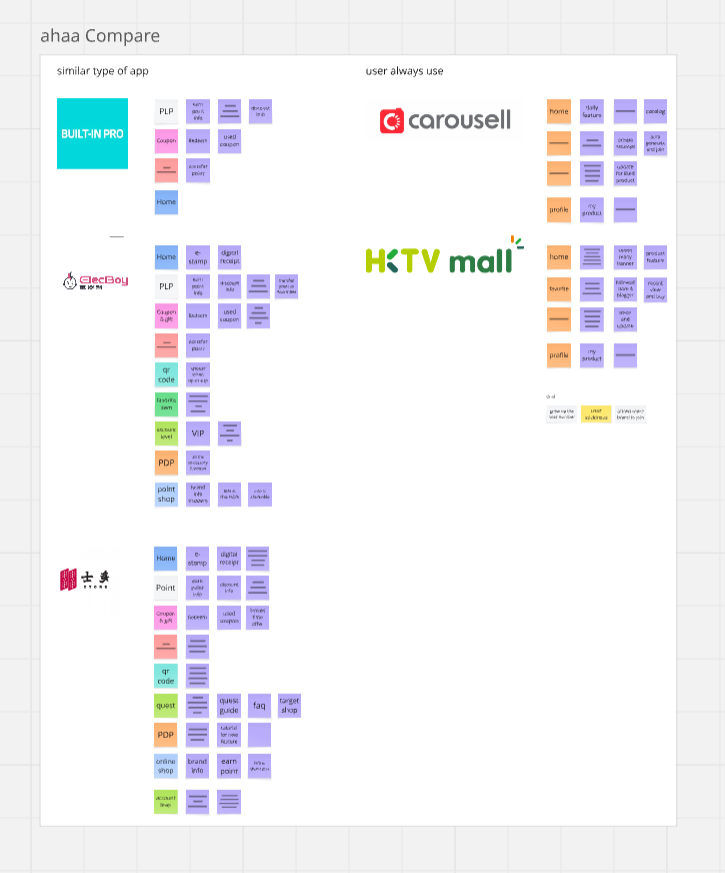
Competitor analysis (Fortress, HKTVmall) + User Journey Mapping + Card Sorting revealed 3 critical pain points:
Decision Paralysis
Users struggled to compare specs across brands
→ High bounce rate on product pages
Trust Issues
Unclear warranty/return policies caused hesitation
→ Cart abandonment at final step
Confusing Categories
Card sorting showed users couldn't find "Smart Home" devices in existing menus
→ High bounce rate on navigation
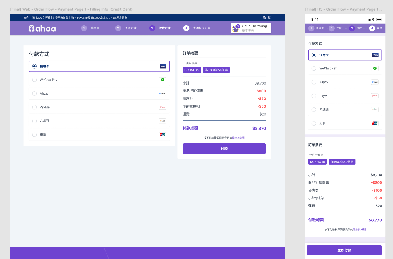
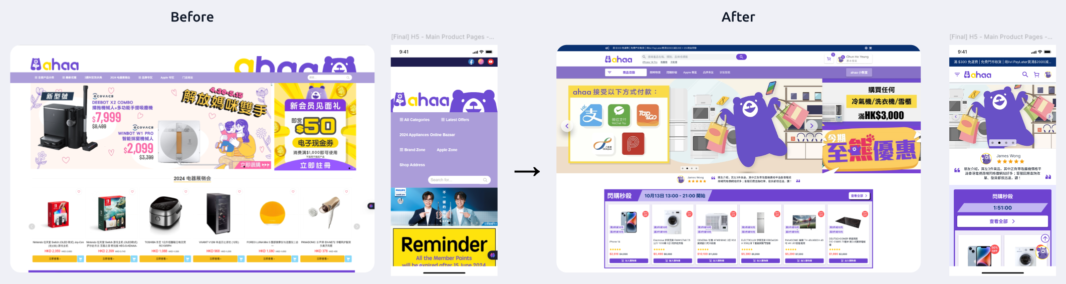
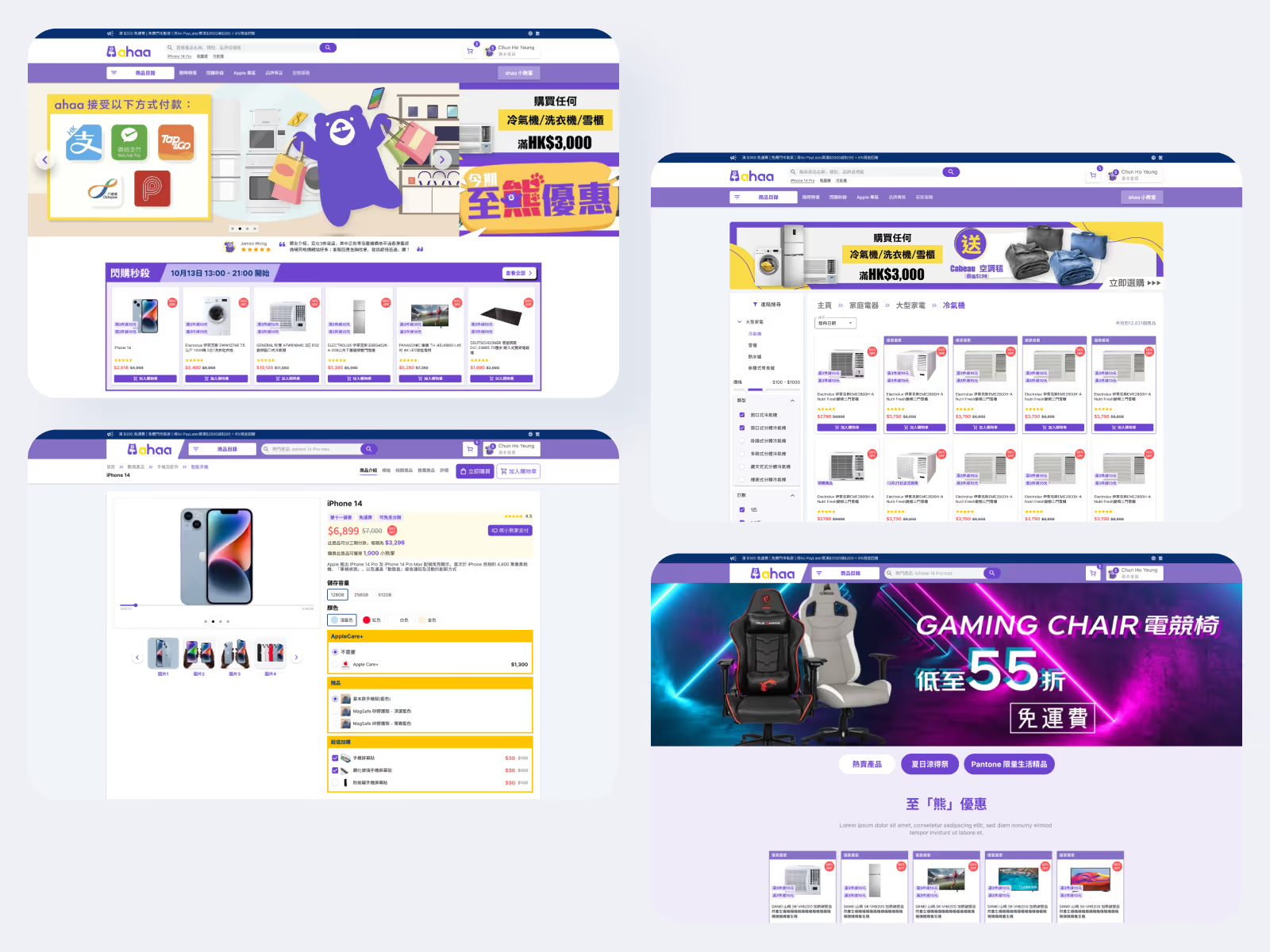
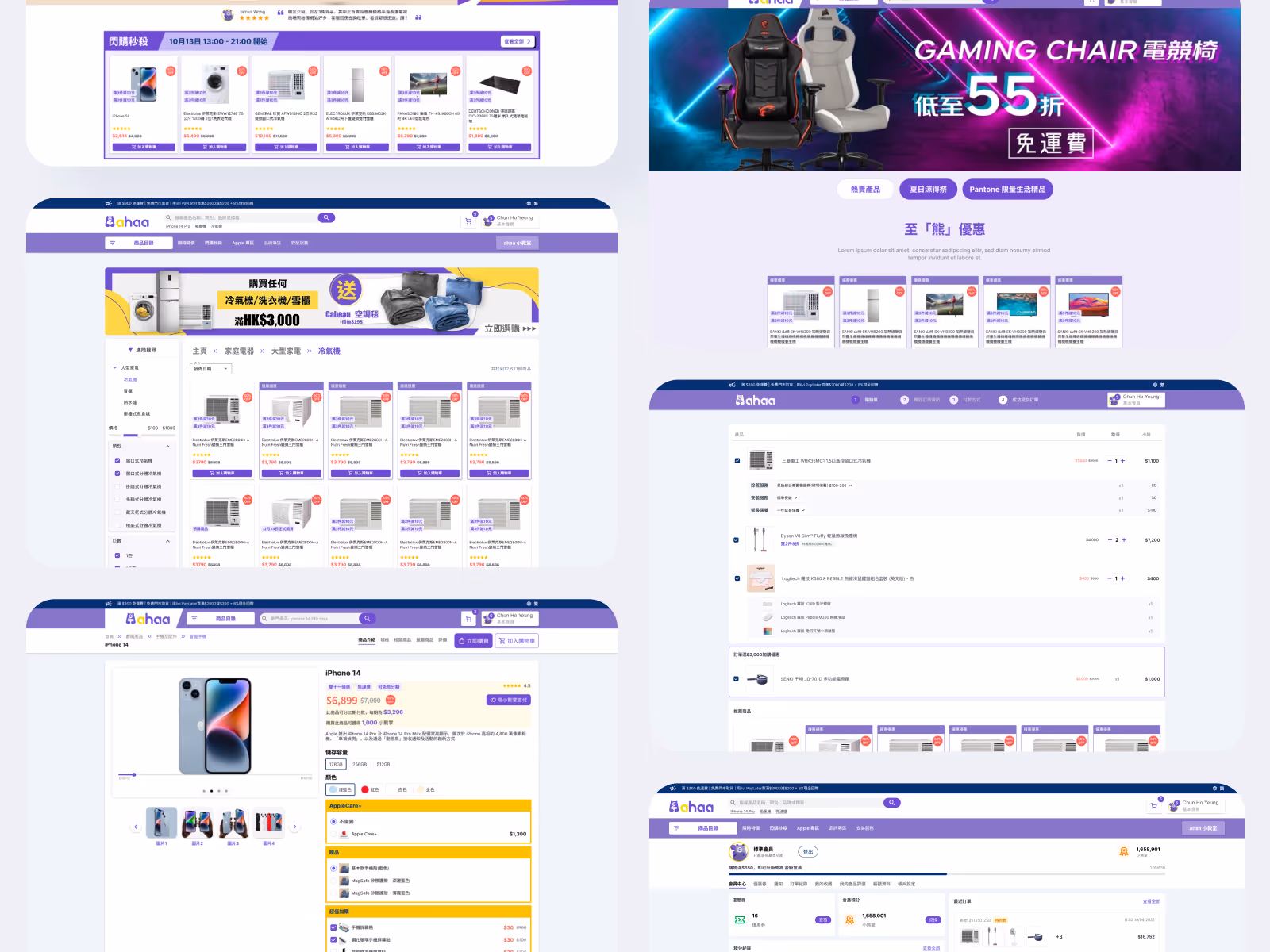
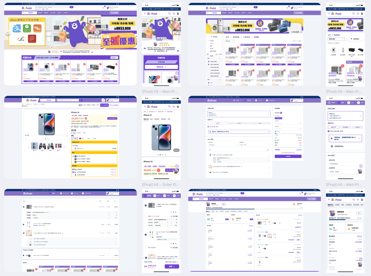
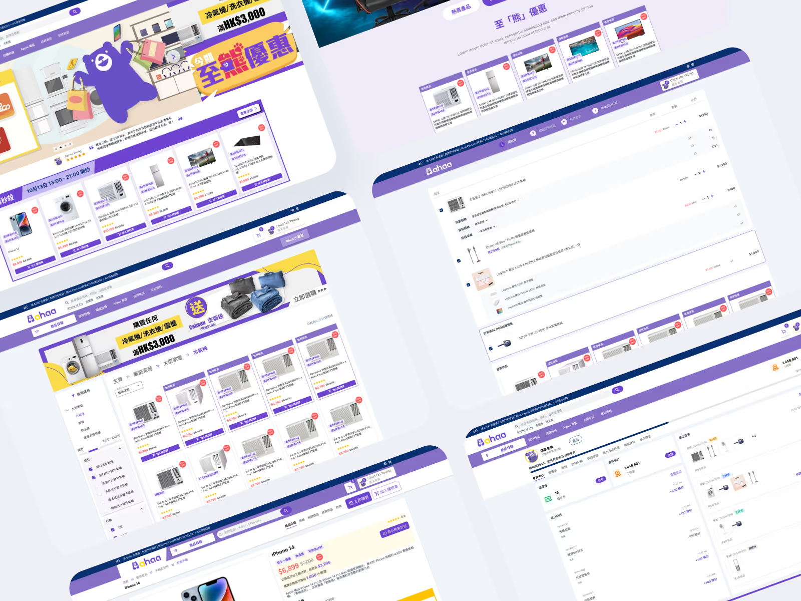
1. Streamlined Checkout Flow
Reduced checkout from 5 steps to 3 steps. Added "Guest Checkout" to remove registration barriers.
Result: 35% decrease in cart abandonment.
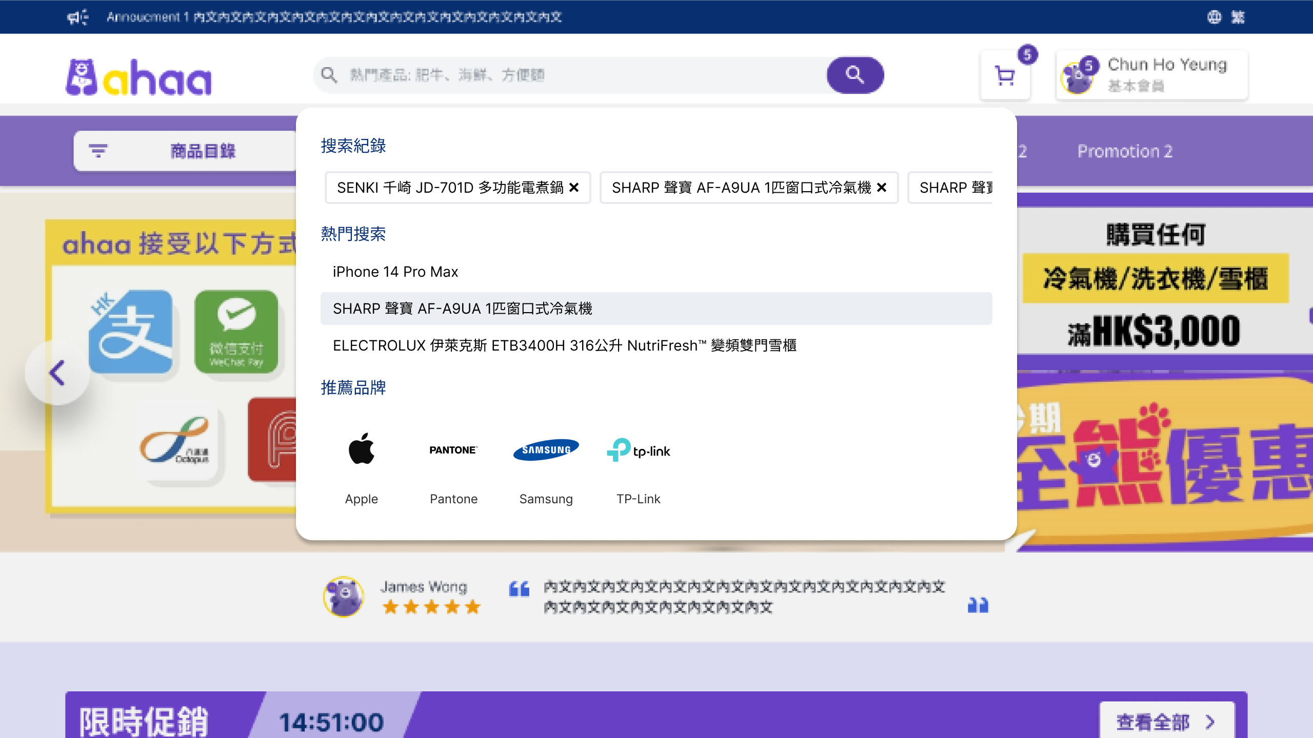
2. Enhanced "Smart Search" & Filtering
Implemented robust filtering (Price, Brand, Specs) and side-by-side product comparison features.
Result: Improved product discoverability, helping users find items 2x faster.
3. Trust-Building & suprising UI Elements
Added clear "Warranty" and offer "payment by installments" on Product Detail Pages (PDP).
Result: Directly addressed persona "trust issues," boosting conversion.

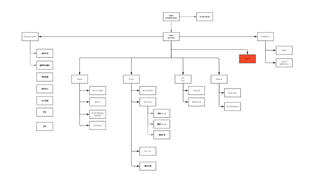
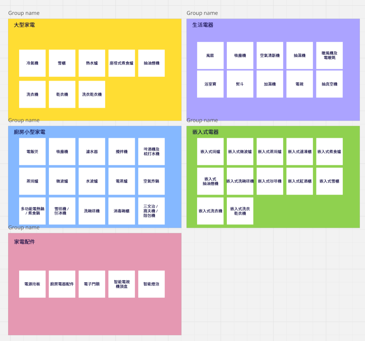
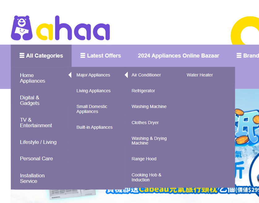
4. IA Restructuring & Card Sorting
Conducted open card sorting sessions to reorganize the product catalog into user-centric categories (e.g., grouping "Air Fryers" under "Kitchen" rather than "Small Appliances").
Result: Created a logical sitemap that reduced "time-to-find" product by 40%.
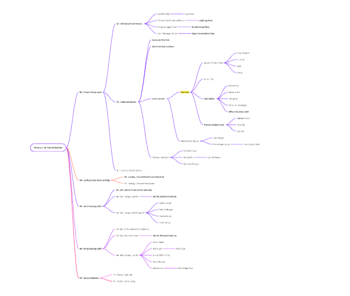
Card Sorting & IA:
Facilitated sorting exercises to define a new, intuitive 3-level navigation hierarchy
(L1 Category → L2 Sub-category → L3 Product Type).
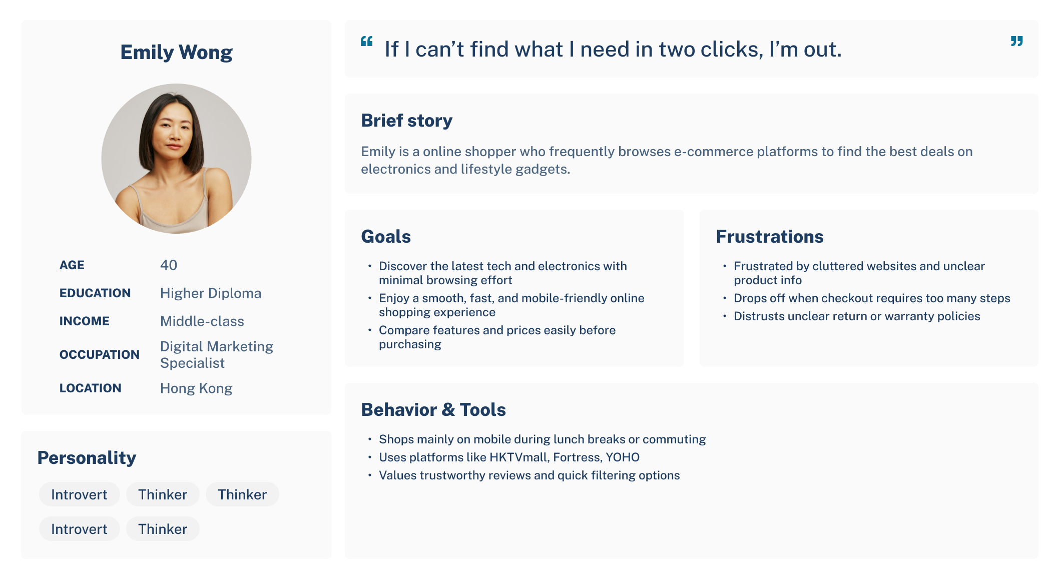
Persona Development:
Created "Emily" (40, Digital Specialist) to focus design on "efficiency" and "deal-hunting."
Journey Mapping:
Identified that users dropped off most frequently when asked to "Register Account" before buying.
→ Solution: Guest Checkout.
Competitive Audit: Analyzed HKTVmall and Fortress to match local user mental models for navigation.
Successful Adaptation:
The design was high-quality enough to be adopted by the parent brand (DCH Living) rather than discarded.
System Flexibility:
The modular design system saved the engineering team weeks of rework during the strategic pivot.
Validated Usability:
Pre-launch testing confirmed the new IA and checkout flow outperformed the legacy system.
Design for Flexibility:
The late-stage rebrand taught me the value of a tokenized design system (using variables for colors/logos), making the switch from Ahaa to DCH painless.
Trust is UX:
For high-ticket items like electronics, "Warranty Info" is just as important as the "Buy" button.
IA is the Foundation:
Card sorting proved that internal company jargon (e.g., "White Goods") confused users; switching to user-friendly terms (e.g., "Large Appliances") instantly improved navigation.